Taken literally, a vignette is a collection or grouping of objects, arranged to draw the eye and create a pleasing focal point. Check out these ideas for using vignettes to bring interest and personality into your living room.
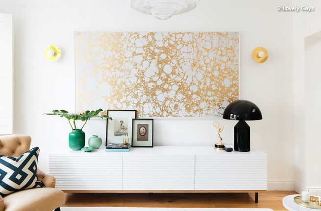
Apply the rule of three
To give your display an interesting, relaxed feel, arrange objects in an asymmetrical formation. This works best if you also apply the ‘rule of three’. When objects are grouped in odd numbers, it creates a more visually interesting display, as the eye is forced to move around it.
On this sideboard, objects have been placed in groups of three to provide a few engaging vignettes.
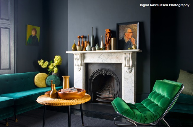
Pick a palette
Give a large group of objects a harmonious look by limiting your colour palette. This mantelpiece contains some 20 disparate items, but the restricted range of hues placed in a perfect arrangement of different heights creates a beautiful visual impact. The vignette brings balance to the room’s strong, moody scheme.
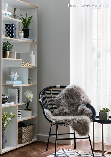
Consider your surface
Bookcases offer some of the most flexible opportunities for vignettes, particularly ones that are divided into manageable sections.
This interesting shelving unit provides an attractive framework for an effortlessly curated display, which creates a strong impact. The series of mini vignettes is the perfect backdrop for a cosy corner like this one.
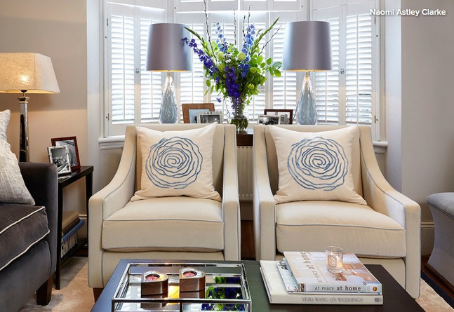
Work with pairs
To prevent a group of objects looking cluttered and untidy, try creating a framework of symmetry around them. This interior designer’s trick is perfect if you want to give a more balanced, formal feel to your vignette.
Here, a pair of lamps provide a strong frame for the exuberant flower arrangement and collection of picture frames.
Draw the eye
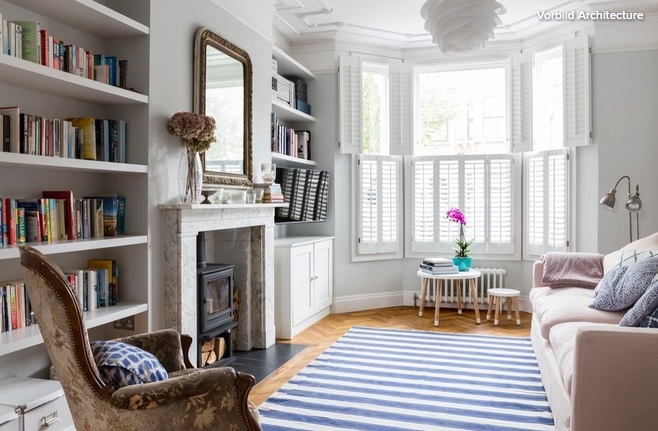
Use vignettes to take your gaze beyond the confines of the room. Here, a simple round table placed in the window requires only a plant and some books to create a focus and draw your eye to the natural light coming from outside.
Spread out
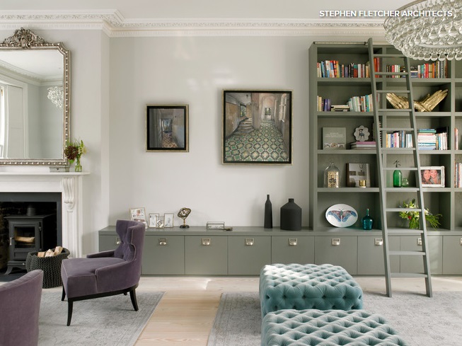
A vignette doesn’t need to be arranged close together, so allow yours a bit of breathing space. The lower section of this bespoke unit lends itself perfectly to this type of display.
The small box, with its combination of glass sides and a black rim, provides the visual link between the glass frames on the left and the black vessels on the right.
Use mirrors as a backdrop
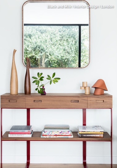
A mirror not only brings a sense of movement to a vignette, it also provides a strong visual anchor for whatever you choose to arrange in front of it. It will introduce height and reflect light around the space.
This design’s simple shape and frame reflect the minimal decorative style of the room, but since a mirror will probably be the first place your eye rests, you can go as bold as you like.
Link vignettes with colours and materials
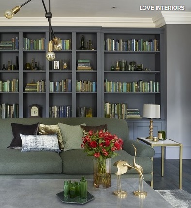
In this living room, there are lots of vignettes dotted around. The items on display are bold and quirky, so could have been visually overwhelming. However, the cohesive colour scheme and careful placement has created a restful and appealing whole.
Gather with a tray
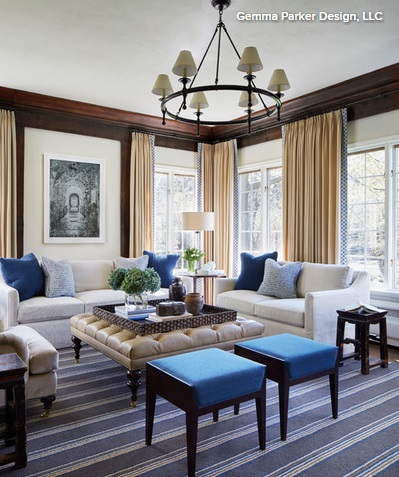
A collection of objects appears instantly more pulled together when placed on a tray. Here, a selection of books, flowers, jars and other objects could seem quite random and untidy. However, by gathering them together on the tray, the designer has given a sense of cohesion to the grouping.
Focus on fabrics
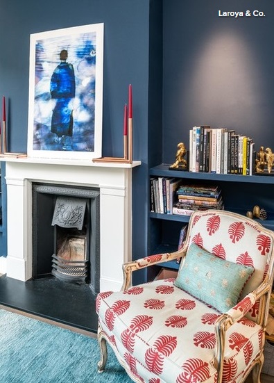
A successful display can be created from more than just an arrangement of objects. Consider also what you can do with fabric. In this colourful living room, the armchair has formed a vignette. The patterned upholstery has been teamed with a cushion in a complementary colour to create an area of visual interest.
Main Image Source – Tumblr
