If you’re wondering whether to invest in a marble splashback, gold taps or a polished concrete floor, read on. Let the trends picked up at this year’s London Design Festival (LDF) help you to decide. At the same time, however, always remember that while the most stylish homes may absorb design trends, they will also – just as with design rules – take them with a hefty pinch of salt and confidently ignore them.
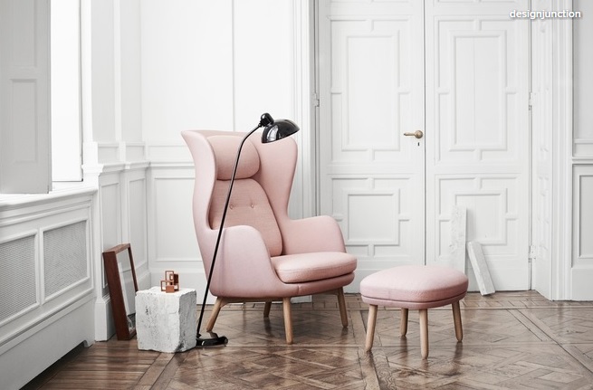
The wingback armchair is reinvented
Our love of all things midcentury isn’t exactly waning, but it’s definitely evolving. This was evident in many of the pieces on show (check out British designer Charlene Mullen’s Marimekko-esque plates and Scandi folk-style illustrations), but most noticeably in the form of the wingback chair.
A midcentury classic, this instantly recognisable seat, with ‘wings’ at head height, has had something of a reinvention and versions of it were plentiful. This curvy pastel take on the chair by Republic of Fritz Hansen is just one example; elsewhere, there were fresh, boxy versions by James UK; extra-tall backs on the Knightsbridge Furniture stand; streamlined, modern designs by Icons of Denmark; injections of teak, and super-cushioned incarnations by Norr11.
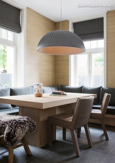 Giant pendants get a sleek makeover
Although there were still plenty of large, factory-style metal shades around, a new breed of oversized pendant was spotted nudging ahead.
Contemporary shapes and materials ruled at lightjunction, part of designjunction, and Danish design brand New Works was just one of the companies with an example on show – theirs came in matt black metal. Huge, textured pendants that looked like giant origami creations were also a thing; check out Foldability.
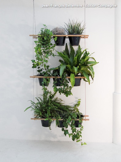
Nature takes over
Biophilia – humans’ need to interact with nature – was officially touted as one of this year’s themes by The London Design Fair, one of the capital-wide Festival’s key events. Across all the shows, plants were everywhere, especially little plants – the sort just perfect for small-space living. Teeny, trailing greenery was particularly popular, displayed in weeny, decorative hangers (a trend in their own right) or cascading out of petite pots on shelves.
Designer Iona Dunsire put on a wonderful display of trailing ivy, planted in her own slatted wood hanging pots, alongside delicate insect-like lighting. Sian Zeng’s Dino wallpaper at Tent depicted green dinosaurs, palms and ferns. And one of the landmark installations of the week was Mini Living ‘Forests’ by Asif Khan, which comprised three lush, plant-filled rooms dotted around the city for members of the public to enjoy.
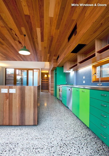
The new marble? Try some terrazzo
Marble most definitely has a competitor: terrazzo, a typically polished composite material with a distinctive speckled look, thanks – traditionally – to the prominent chips of quartz, granite or glass that feature in its makeup.
Terrazzo has commonly been used, as seen here, as a floor or wall surface, and featured a lot in midcentury design – think of the shiny, speckled communal staircases in so many 1950s and 1960s blocks of flats. However…
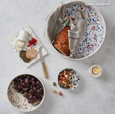
…all over the Festival there were accessories inspired by the look of this retro material. Sevak Zargarian’s clay Unearthed collection, pictured here, is shot through with shards of a marble-like porcelain material called Parian for a similar effect.
Danish designer Troels Flensted mixed acrylic powder, resin and ‘speckles’ of coloured pigment to create his Poured tables and Poured bowls, which also have the appearance of terrazzo. Olivia Aspinall’s tiles tapped into the trend, too.
Elsewhere, the effect was created using heat-resistant rubber. Swiss design duo Loris & Livia took inspiration from the speckled flooring on London Underground carriages for their coasters and placemats.
The base mix for terrazzo – the bit that the ‘speckles’ are set into – is often concrete. However, the whole mixture can also be made with plastics, and this has opened up a new, interesting and ecofriendly direction, since it works very well with recycled materials. Expect to see lots of examples coming your way.
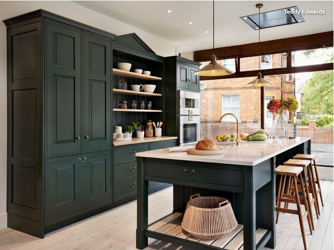
Cool dark green is hot news
It’s the new grey, the new indigo and the new black all rolled into one (and don’t assume it’s time to repaint those moody hues, either – this is just the newest incarnation).
This classical shade is popping up on walls, cupboards and upholstery all over Houzz and was very much in evidence during LDF. It also features in the official complementary palette that accompanies the Dulux Colour of the Year 2017, announced this August. It’s going to be huge. Get in early.
Concrete evolves
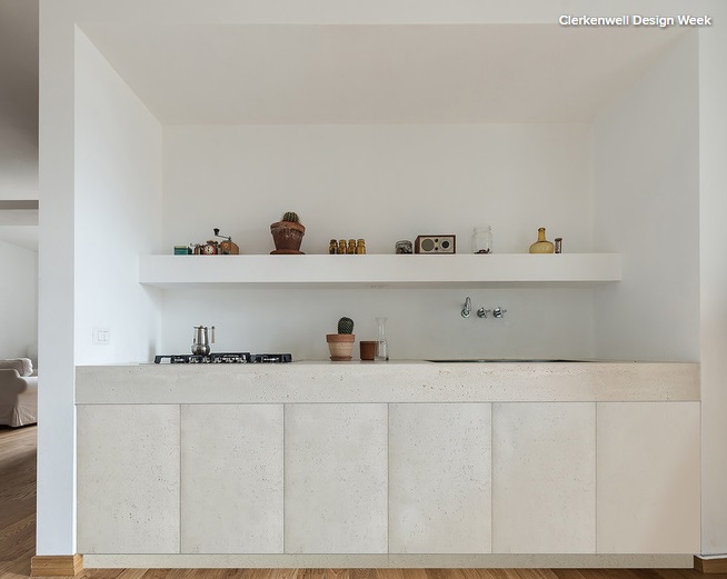
This kitchen, by French company Concrete LCDA, popped up earlier in the year at Clerkenwell Design Week, but it signalled a move forwards for concrete into something sleeker, softer and less industrial.
At 100% Design there were colourful concrete bathroom basins by Kast Concrete Basins in a rainbow of shades (could a return to coloured bathrooms be another trend brewing?). Room 9 had concrete so smooth, pale and highly polished it looked like soapstone, and Polish company Concreate used it as a material for its wall panelling. Talking of which…
Cladding is back
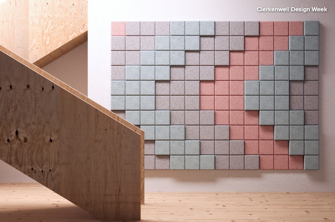
Yes, even stone cladding, last fashionable in the 1970s, is a continuing trend, building on the popularity of those staggered, 3D tiles that have been seen on the high street for a while. Wooden decorative panelling for walls also continues to grow in popularity, with geometric cut-outs and marquetry featuring heavily.
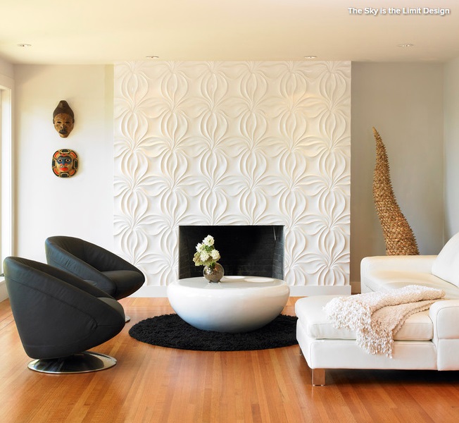
So many stands featured different approaches to this textured wall panel theme and a multitude of materials were used.
Pietraelite went retro and rustic, while Warssawa showcased a pastel-hued geometric cement tile range, and new graduate Anni Taverner’s antique-effect panels incorporated gilded metals and verdigris.
The new metallics
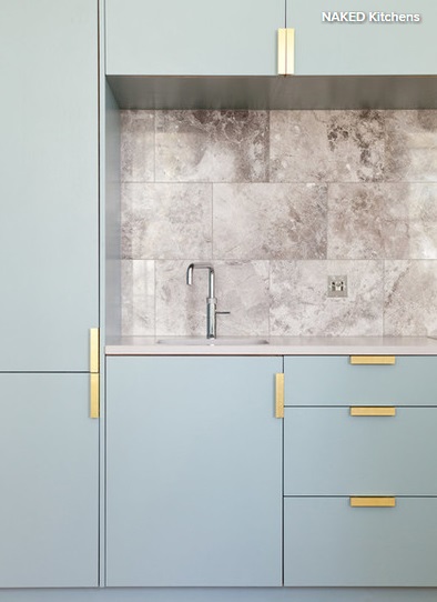
Shiny metallics have been a big trend for the past few years, but there were significantly fewer of them on show this year. Gold and brass, however, did still pop up in small design details, such as handles and hinges, as seen here. Also spied was parquet flooring inlaid with slim strips of brass (and parquet, which was everywhere, clearly remains hugely on-trend). Designer Bethan Gray’s ornate – and rather midcentury-ish – new furniture also featured brass used in a similar way.
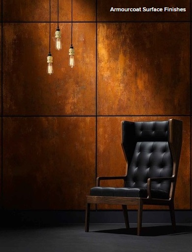
That doesn’t mean metallics are out of fashion at all, more that a new approach to these materials is coming through in the form of oxidised and rusted metals. In the same way that antiqued mirror is becoming popular, this ‘lived-in’ approach to metallics adds character to a space and, with orange and brown tones, plenty of warm colour, too.
Here, the finish has been used in sheet form to create wall panels (another trend, see above), and this look is something that’s starting to be used outside, in garden features or as cladding for extensions. But it can be small-scale, too: at LDF, Mammalampa’s Queen pendant shades – gold coloured on the inside and oxidised on the outside – were spotted at the Mint Furniture stand.
Marble moves on
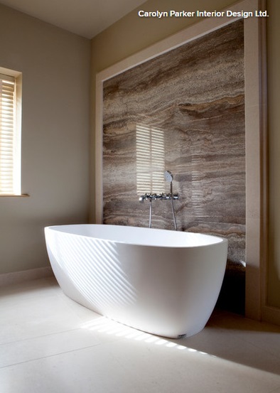
What was spotted around the various shows and events at this year’s LDF were more marble features that used warmer or coloured incarnations: browns, sandy shades and pinks.
This was also a trend highlighted in a talk by trend forecasting company WGSN at 100% Design as something to watch out for in spring/summer 2018.
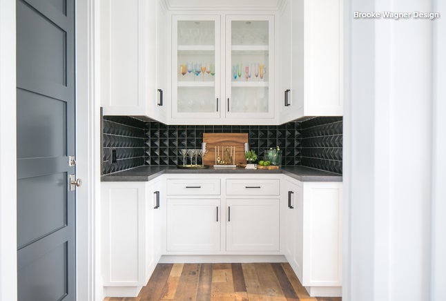
Tiles go for texture
Tiles, overlapping somewhat with the already-mentioned wall panelling, were everywhere.
Although the hugely patterned encaustic concrete tiles we’ve loved for the past few years aren’t going anywhere, what was on show during the Festival was something new. Rather than pattern from colour, the trend was for pattern formed by the shape of the tiles themselves, as seen in this kitchen.
3D was a big look, with Theia Creative Tiles providing a good example of tactile geometric designs that stand out from the wall. Concrete hexagon tiles with colourful borders were used to decorate Charlene Mullen’s stand, perhaps hinting at a chunkier new direction for this already popular eight-sided trend, while at the Ateliers Zelij stand, beautiful, one-colour mosaics had been made from uneven tile fragments to create texture.
Source: Houzz
