
Are you a ‘pastel person’? Perhaps you’ve always found sugary shades too sickly for your palate, or have been put off by a dodgy paint colour you’ve had to live with in the past. Used sparingly, pastels lend themselves to some stunning and creative combinations, as these interiors prove. Spring is the time to bring some pretty, petal-inspired shades into your home, so put aside your preconceptions and prepare to embrace pastel perfection.
Crave colour
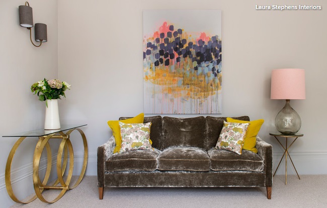
Pitch pastels against brights for a surprisingly sweet synthesis. The grey backdrop in this luxe living space provides the neutral base needed for creative colour combining. Soft pastel tones taken from the printed cushions are echoed in the brighter, bolder artwork, creating a sense of harmony, while the pink lampshade continues the pastel theme and the brass accents mimic golden tones found elsewhere in the décor.
Find beauty in function
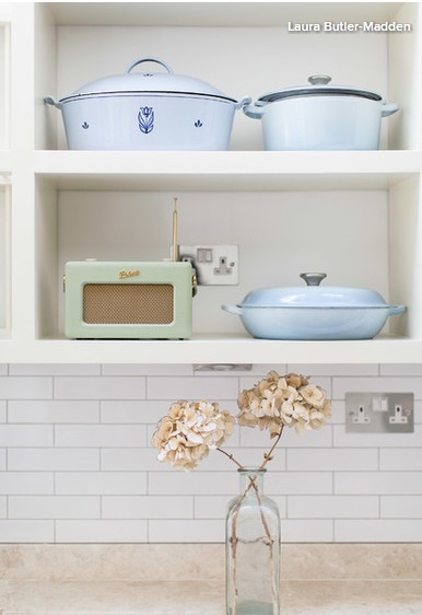
Give your kitchen a quick boost with pastel enamelware or crockery. These baby blue pots and pans provide soft colour that’s demure but joyful. Start your coordinated collection today – or mix things up with a plethora of pastel accessories that you can display or pack away, according to your mood.
Set the tone
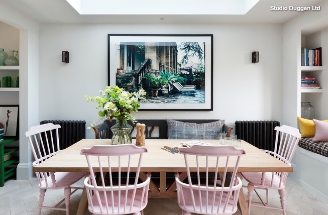
Temper a set of pink chairs – or other pastel-painted furniture – by combining them with heavier elements that add weight to the scheme. This dining room is largely monochrome with pale timber and a few colourful cushions. The black radiators and matching bench feel sturdy and fuss free, countering the delicacy of the spindle-back chairs.
To create a different effect, try heavier, farmhouse-style chairs in a pastel hue, which would give a kitsch, country vibe.
Discover duck egg
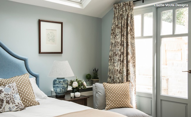
Make no mistake – muted blue paint can deliver ambience and elegance in spades. Treat this subtle pastel to a palette of quiet neutrals and you’ll preserve its calm qualities. Caramel soft furnishings work with duck egg upholstery and dark wood to create the kind of sleep space you’d readily reserve an early night for.
When mixing prints in any colour, sticking to the same shade but selecting a different scale will make your pattern combining look purposeful. Give geometric fabrics a floral partner and see if the styles mesh as well as they do in this bedroom.
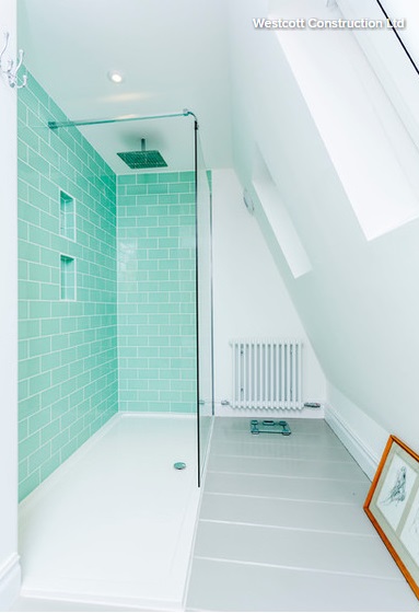
Try a mint makeover
Show a loft conversion shower room some love with white walls to help the small area feel bright and spacious, and perky peppermint tiles to seal the deal. Pale grey paint gives the floor a touch of contrast, which helps to add depth to the room.
Here, the mint tiles take centre stage, so clutter has been kept to a minimum with discreet storage to prevent the shower tray becoming a bottle bank. The sleek alcoves were created in the stud wall before being framed out and tiled.
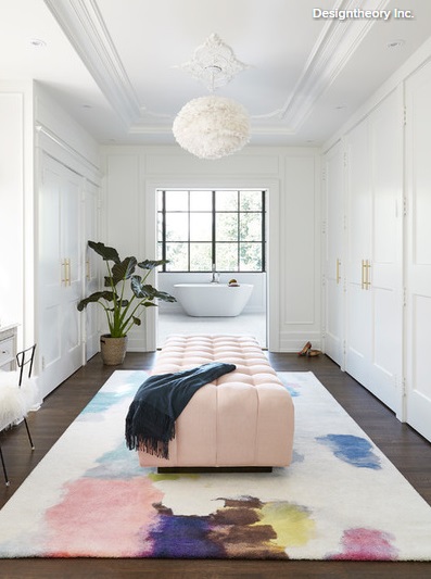
Collar a key piece
A large rug can be truly transformative, lending a new lease of life to established furnishings or introducing a more contemporary colour scheme. This painterly piece sets the tone for the delicate dressing room, lifting the dark wood floor with daubs of colour on a neutral background. Picking out an accent shade (here, it’s pale pink) is a simple way to create a cohesive theme that will unify your accessories. And making this piece a pastel hue keeps the overall effect soft.
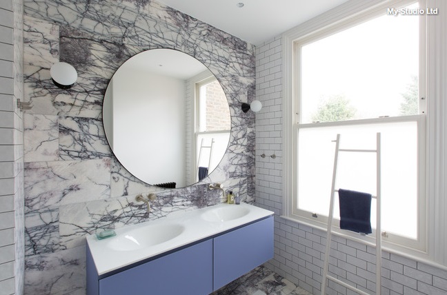
Be bold in the bathroom
Pastels aren’t usually associated with making a strong statement, but this beaut of a bathroom proves that it’s possible. The walls and floors are ‘zoned’ and clad with Calacatta Viola marble in the wet areas. This dramatic natural stone displays deep purple veining, which pairs perfectly with the lilac vanity. Natural and man-made tiles sit stylishly side by side, with orderly metros showcasing the wild pattern of the marble.
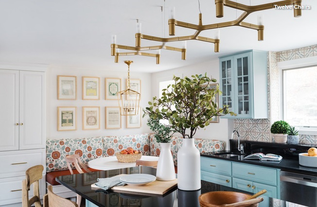
Get creative in the kitchen
Don’t fear colour in the kitchen, especially if you’re looking to avoid a utilitarian effect. And it doesn’t have to be bold.
Painted cabinets offer versatility – here, turquoise is used to pick out one area of cupboards, while white makes others recede into the background.
The gentle turquoise softens the space, as does the cosy bespoke banquette seating – a savvy choice for an awkward corner.
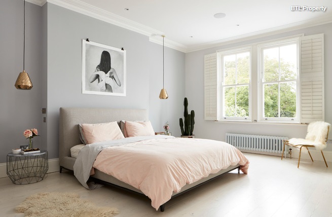
Swap your sheets
Switch out white bedding for barely-there blush pink sheets. This one change will have a noticeable impact on the mood of your boudoir – and petal-shades are perfect for spring. While cotton is a classic choice, and washed linen looks even more lovely, particularly when left a little ‘undone’. No ironing and a new look? This tip is too easy to ignore.